
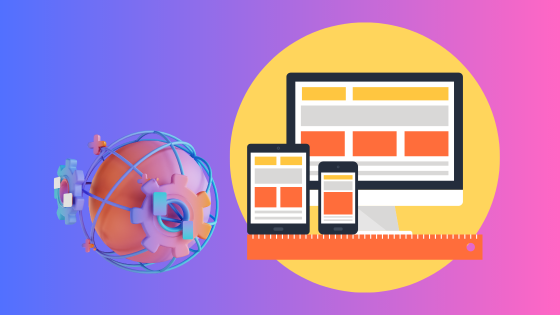
Responsive Web Design (RWD) allows different layouts to adapt based on different screen sizes. But what does a different screen size mean? Think of RWD as a blueprint for a new house. When designing a house, there are multiple breakpoints for different areas. Similarly, in web design, breakpoints determine how a website layout changes when the browser width falls within a specific range.
Understanding Breakpoints
In Responsive Web Design, breakpoints are defined by browser widths. When the browser width changes and falls within a declared range, the website layout adjusts automatically.
Typically, every responsive design focuses on two main breakpoints:
- Tablets
- Mobile Devices
These breakpoints are often based on the screen sizes of popular devices like the iPhone and iPad, as they are widely used around the world.
The Fluid Nature of Responsive Web Design
A responsive website looks great on all major screen dimensions of popular devices. Think about the three states of matter on Earth: solids, liquids, and gases. RWD is much like liquid (water) — water has no fixed shape and takes the form of its container. Similarly, it has no rigid structure; it adapts based on the device it’s viewed on.
How Responsive Web Design Works
Responsive Web Design services use a combination of CSS media queries and HTML to:
- Resize
- Shrink
- Enlarge
- Move content
This ensures that the website looks good across a wide range of devices and screen sizes.
Why Should You Use Responsive Design?
- Universal Look and Feel: RWD ensures your website provides a consistent experience across all devices and screen resolutions.
- Fluidity: Like water, your design grows, shrinks, and adjusts based on the viewer’s device.
- Consistency: With RWD, your content and layout remain consistent, no matter which device a user chooses.
- Cost-Effective: A single responsive website design eliminates the need for separate versions for desktop and mobile.
Responsiveness is not just about adapting to specific screen sizes. True responsiveness means your design naturally grows, shrinks, and adjusts to fit any device.
Responsive Web Design is super easy to implement into your prototypes with Bytesflow Technologies. To learn more about how we can help you build stunning, responsive websites, reach out to our Responsive Web Design Company today!


